Chapter 1 Value stream mapping to identify your Mura and Muri
I have written this workbook for lean production managers who have already made some progress on their Lean journey. I assume you have already completed the following steps:
- You have identified what your customer values.
- You have already mapped your previous state.
- You have identified and moved to an improved current state.
- You have identified and removed all non-value adding activities.
- Your production lines are well-balanced, and you meet your takt time.
- All of your internal changeover operations have been made external, set-up times and costs are minimal.
- Activities occur concurrently rather than sequentially whenever possible.
- You conduct regular, successful Kaizen activities.
In short, you have removed all of the Muda from your Lean value stream. If this sounds unfamiliar to you, please refer to Rother and Shook (1999).
Your next step is to design the dynamic behavior of your value stream. Partly, this dynamic behavior is a consequence of factors outside of your direct control such as customer demand and lead-times. However, more importantly, it is also driven by your decisions and actions. For example, your forecasts, batch sizes, and replenishment algorithms will affect the dynamic behavior of your value stream. What many managers don’t appreciate is that your value stream’s dynamic behavior can be designed and this is what this Setting the Cadence of Your Pacemaker workbook is all about.
1.1 Value stream mapping to understand dynamic behavior
In the tradition of the value stream mapping (VSM) workbooks started by Rother and Shook (1999), let us learn-by-doing by considering an as-is situation. Take a look at the VSM of the fictitious company Acme Ltd in Figure 1.1. Much of it may already be familiar to you, however Appendix A summaries the main components and structure of a value stream map if you are a little unsure of how to read them. Alternatively please refer to Rother and Shook (1999), or Jones and Womack (2011) for an introduction to this technique. Appendix A also provides some background information of the Acme Ltd case. The first big difference is that the Enterprise Resource Planning (ERP) system is portrayed in detail by breaking it down into its four major parts: forecasting, production planning, detailed scheduling, and material requirements planning (MRP). The other significant difference is the time series data collected from the value stream1 that is shown in Figure 1.2. Here we can see the customer demand and its forecast for the last 52 weeks in the top panel. The middle panel shows the level of the raw materials inventory, finished goods inventory, and vendor managed inventory over the same period. The bottom panel show four production/replenishment targets: planning production targets, confirmed production targets, actual production completions, and supplier call-off orders. The use of the information in Figure 1.2 will be covered in some detail as we go through this work book.
The VSM map represents a single raw material/final product/customer pairing selected as representative of the issues in your supply chain. Most likely your supply chain is much more complicated than this, but the aim of this workbook is not to replicate real-world intricacies, but to clearly explain the essentials of the solution procedure. While I recommend that you start with a medium to high volume product, you may want to repeat this VSM mapping exercise with a few products with different supply chain characteristics to get a broad understanding of the issues involved. However, after a few investigations, I am sure this approach will become second nature to you, and there will be little need to map every raw material/final product/customer pairing in your business in such detail.
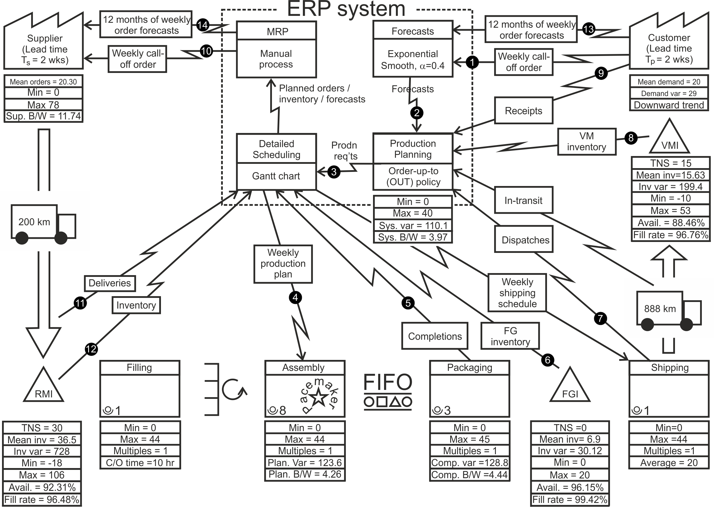
Figure 1.1: Value stream map of the material and information flow within Acme Ltd
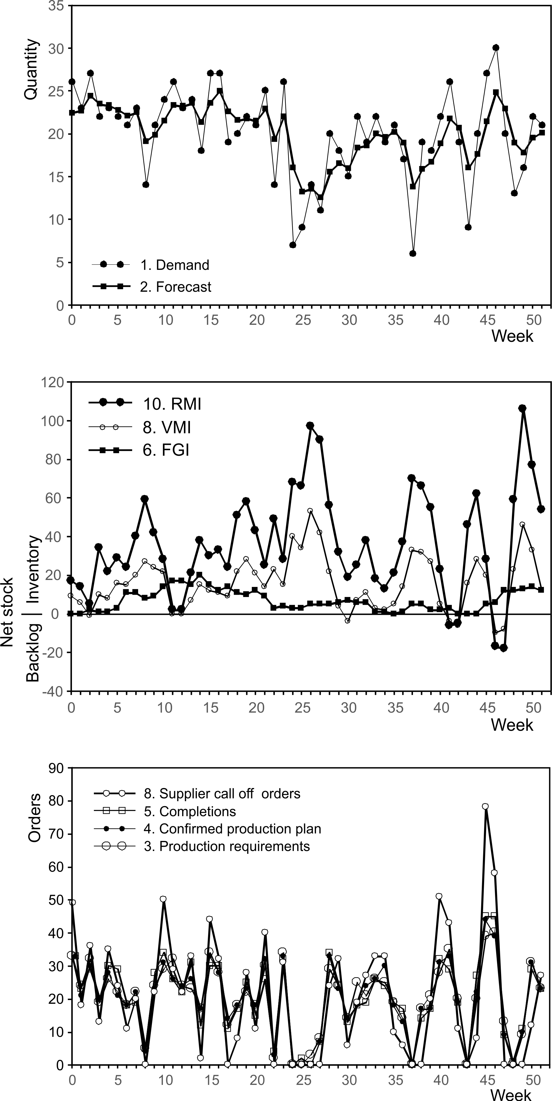
Figure 1.2: Time series plots of the material and information flow within Acme Ltd
1.2 Features of the dynamic VSM map
Given that you are already familiar with value stream mapping let’s focus our attention on the most critical aspects of this dynamic VSM and the fundamental differences to a traditional VSM.
Pacemaker. The pacemaker is the point in which the information flow regulates the material flow. In the Acme Ltd example in Figure 1.1 this is the assembly process. The pacemaker is the only part of our value stream that needs to be scheduled directly. Downstream2 from the pacemaker, the workstations are controlled by first-in-first-out (FIFO) queues; they just process the items arriving from upstream stations in order of arrival. Upstream from the pacemaker, the workstations are controlled by Kanban supermarkets. The pacemaker process is often the first process in the manufacturing sequence not operated in batch mode. A kanban supermarket is an inventory that decouples the single piece FIFO flow downstream from the pacemaker from the batch flow upstream from the pacemaker. Alternatively, the pacemaker process may also be the most upstream process that allows the customer demand to be met within their desired lead-time.
The planning cycle frequency. Acme Ltd operates on a weekly planning cycle3. The weekly planning cycle can be seen in the weekly call-off order from customers and to suppliers, as well as the weekly production and distribution cycles.
Enterprise resource planning system. Most companies have a material requirement planning system (MRP), manufacturing resource planning (MRP-II) or enterprise resources planning (ERP) system for keeping track of purchases, supplier deliveries, production, sales, and shipments to customers, etc. While these systems have fallen out of favor recently, they are very sophisticated computer systems, and if used sparingly and in the right way, ERP systems are powerful and useful tools. In this workbook, we will use the most modern term, ERP, to refer to any generic commercial IT planning system, whether it is an MRP, MRP-II or ERP system (or one of the many other terms). We will reserve the MRP moniker for the task of placing call-off and forecast orders onto suppliers; we will consider this in detail in Chapter 6.
ERP systems are used to plan and record commercial supply chain transactions. The workflow in ERP systems typically starts by updating forecasts of demand for final assembly items by delivery location over the next 3-6 months in (often weekly) time buckets. Demand and forecast information passes to a planning book where, together with inventory, production and delivery information, a master production schedule (MPS) is calculated. The MPS is constructed with one of two basic approaches in MRP systems. The first method, suitable for high volume products produced every period, is the order-up-to policy. The second method is the economic order quantity approach, used for small volume situations or in cases with high set-up/changeover costs. Next, the MPS is exploded out down through the bill of materials (BOM) and work assigned to individual production facilities (machines, workstations, assembly lines, etc.) in a detailed production planning module that considers changeover costs and times. Here minute-by-minute, hour-by-hour production plans can often be manipulated in a Gantt chant-like interface to account for factors such as maintenance schedules, urgent shipping requirements, raw material availability, and national holidays. Finally, the ERP system uses the confirmed production plan, the forecasts of future demand, and BOM information to issue call-off orders (as well as forecasted orders in each week over the next six months or so) to the supplier.
Vendor managed inventory, VMI. VMI is the inventory held at your customer’s site acting as his raw material. You might not have a VMI agreement with your customer, and the inventory there could be owned by the customer (see Holweg et al. (2005) for a conceptual consideration of different VMI arrangements). However, if you can see how much stock is there, you can manage it as if it was your own. In other situations, you could be supplying another part of your company, in which case ownership and data access may not be an issue. Alternatively, if your customer demand is satisfied from your finished goods inventory (FGI) in a factory gate pricing arrangement, your lead-time will be shorter (as you don’t have to account for the transport lead-time), but all the principles in this workbook are still applicable.
Raw material inventory, RMI. RMI is the inventory available as raw material or subassemblies that have been delivered to your goods-in stores from your supplier. There may, or may not, be some VMI arrangement with your supplier about how the inventory is controlled and who owns this inventory.
Min. The term min has two meanings depending on context. If it refers to a stock location, it is the minimum inventory level observed during the data collection period. If it relates to a value-adding process step it is a minimum production quantity.
Max. The term max also has two meanings, depending on context. When applied to an inventory location, it refers to the maximum inventory level observed. If it relates to a value-adding process step it denotes a maximum production quantity that can be produced in a single planning cycle (including all overtime/subcontracting available). If multiple machines or production lines can process the item, we should use the term to indicate maximum the total capacity available. The maximum production quantity provides a limit to the size of orders that can be produced without that work spilling over into subsequent planning cycles.
Multiples. Perhaps multiples or increments of production must be scheduled. For example, maybe production must occur in multiples of single units, boxes, crates, or bags/sacks.
Availability. Availability is a measure of inventory service. It measures the proportion of planning periods that end with inventory available and has a direct link to inventory holding and backlog costs.
\[\begin{align} \tag{1.1} Availability=\frac{\text{Number of periods not ending with ia backlog}}{\text{Total number of periods}} \end{align}\]
Fill rate. The fill rate is another service measure and is defined as the proportion of demand fulfilled directly from inventory. The fill rate is a popular metric in the fast-moving consumer goods industry.
\[\begin{align} \tag{1.2} Fill\text{ }rate=\frac{\mathbb{E}[\text{Demand fulfiled immediately from stock}]}{\mathbb{E}[\text{Demand}]} \end{align}\]
The demand fulfilled immediately from the stock in each period, \(f_t\), can be calculated with 4: \[\begin{align} \tag{1.3} f_t=\text{min}[[d_t]^+,[d_t+i_t]^+], \end{align}\] and the positive demand is \([d]^+\). The fill rate is then the ratio of these two variables over time: \[\begin{align} \tag{1.4} Fill\text{ }rate=\sum_i^n f_{t-i} \bigg/ \sum_i^n [d_{t-i}]^+. \end{align}\]
The difference between the availability and fill rate measures.
Notice there is a difference between the availability measure and the fill rate measure. Think of availability as the proportion of days where a bakery runs out of croissants. Almost always the bakery runs out of croissants in the late afternoon. Availability is near zero. However, because most of the demand for croissants occurs in the morning, the baker’s fill rate, the proportion of croissant demand satisfied from stock, could be very high.Note, both availability and fill rate measures could apply to the VMI/FGI from which you satisfy customer demand (in which case it measures your own availability/fill rate). Alternatively, they could be applied to the RMI (and then measures your supplier’s performance).
Example: Calculating the availability and fill rate metrics Table 1.1 contains the time series of the VMI inventory location in the VSM. In the first column of Table 1.1, we have the time index. The second column contains the demand, \(d_t\) , which could be positive or negative (a negative demand means there must be a net return of product from customers). As satisfying negative demand makes no sense, we determine the positive demand, \([d_t]^+\), in the third column. At the bottom of the third column, we have summed the total of the positive demand, \(\sum_{t=1}^{10}[d_t]^+\). The fourth column contains information about the net stock position. Now, \[\begin{align} \tag{1.5} \text{Net stock = (Inventory on-hand) – (Backlogs)}. \end{align}\] In period one, we can see the net stock is 3, indicating that there are three units of inventory on-hand and there is no backlog (or shortage, depending on whether unmet demand is backlogged or lost). In period two the net stock position is 4. Thus there are four units of inventory on-hand and no backlog. In period three, we can see that the net stock is \(-4\) indicating there are zero inventory and a backlog of four units. Note, that there is either inventory on-hand or a shortage. It is not possible to have both inventory and a backlog (although you could have no inventory and no backlog when the net stock is zero). In the fifth column, labelled Count, we have used unity to indicate the net stock is non-negative and zero to designate the net stock is negative. There are six periods with a positive inventory and a total of ten periods in our time series. Thus, the availability measure is \[\begin{align} \tag{1.6} \text{Availability} = \frac{6}{10}\times 100\%=60\%. \end{align}\] The fill rate calculation is completed in the final two columns. In the sixth column, we add together the demand and the net stock in each period. If this sum is negative, this is set to zero instead. The last column represents the demand in a period that is satisfied directly. The fulfilled demand is either the minimum of either the positive demand (it makes no sense to count meeting a negative demand) or the sum of the positive demand and the net stock (which we just calculated in the previous column). The fill rate is calculated as the sum of the fulfilled demand, \(\sum_{t=1}^{10}\text{min}\{[d_t]^+,[ns_t+d_t]^+\}\), divided by the total positive demand, \(\sum_{t=1}^{10}[d_t]^+\). Thus, the fill rate is \((74/90)\times 100\% =82.22 \%\).
| \(t\) | Demand, \(d_t\) | Positive demand, \([d_t]^+\) | Net stock, \(ns_t\) | Count, \(\{\text{0 if }ns_t < 0,\) \(\text{ 1 otherwise.}\) | Positive net stock plus demand, \([ns_t+d_t]^+\) | Fulfilled demand, \(\text{min}[[d_t]^+,[ns_t+d_t]^+]\) |
|---|---|---|---|---|---|---|
| 1 | 11 | 11 | 3 | 1 | 14 | 11 |
| 2 | 12 | 12 | 4 | 1 | 16 | 12 |
| 3 | 9 | 9 | -4 | 0 | 5 | 5 |
| 4 | 7 | 7 | 3 | 1 | 10 | 7 |
| 5 | 8 | 8 | -5 | 0 | 3 | 3 |
| 6 | 10 | 10 | 2 | 1 | 12 | 10 |
| 7 | -2 | 0 | 0 | 1 | 0 | 0 |
| 8 | 7 | 7 | 0 | 1 | 7 | 7 |
| 9 | 17 | 17 | -5 | 0 | 12 | 12 |
| 10 | 9 | 9 | -2 | 0 | 7 | 7 |
| Total= | 90 | Average= | 0.6 | Total fulfilled demand= | 74 | |
| Availability= | 60% | Fill rate= | 82.22% |
TNS. Target net stock or the safety stock. The TNS is a decision variable that can be set to minimize inventory holding and backlog costs or to meet the desired fill rate. Too much safety stock means you have excessive money invested in inventory. Too little safety stock results in disappointed customers and an over-reliance on rush orders and expedited transportation. Note that the safety stock is a target, about which inventory will fluctuate above and below. It is not a minimum required stock level (the minimum required inventory is zero).
Mean inventory. The average, or mean, inventory will never always equal the TNS as the future demand is not 100% predictable or controllable. However, when the average inventory is wildly different from the TNS for extended periods, then either the safety stock mechanism is being incorrectly used, or the lead-time information in your ERP system is incorrect.
The lead times, \(T_p\) and \(T_s\). The VSM also describes two lead-times. One of the lead-times, \(T_p\), is from the moment the customer places his order to receipt of that order into his VMI. The second lead time, \(T_s\), is from the moment Acme Ltd places an order onto the supplier until that order is received in Acme’s RMI.
Figure 1.3 shows the customer’s lead time, \(T_p\), first consists of an information delay, via the customer’s weekly call-off order, through the forecasting module, production planning, and detailed scheduling until the weekly production planning meeting issues a production plan to the pacemaker, the assembly station. Then comes the material delay, through the assembly and packaging activities, into FGI and onto shipping, where items are loaded onto trucks and then driven 888km to the customer’s VMI inventory (which may or may not be owned by Acme Ltd but is assumed here to be visible and controlled by Acme Ltd).
The supplier’s lead-time, \(T_s\), starts when we issue call-off orders from our MRP system (based on our current production plan and inventory position) and ends when we receive those orders in the RMI, see Figure 1.3. The supplier will need to go through some process to convert Acme orders into production targets, manufacture and deliver those orders. We are not concerned with how that is done–this is the supplier’s business.
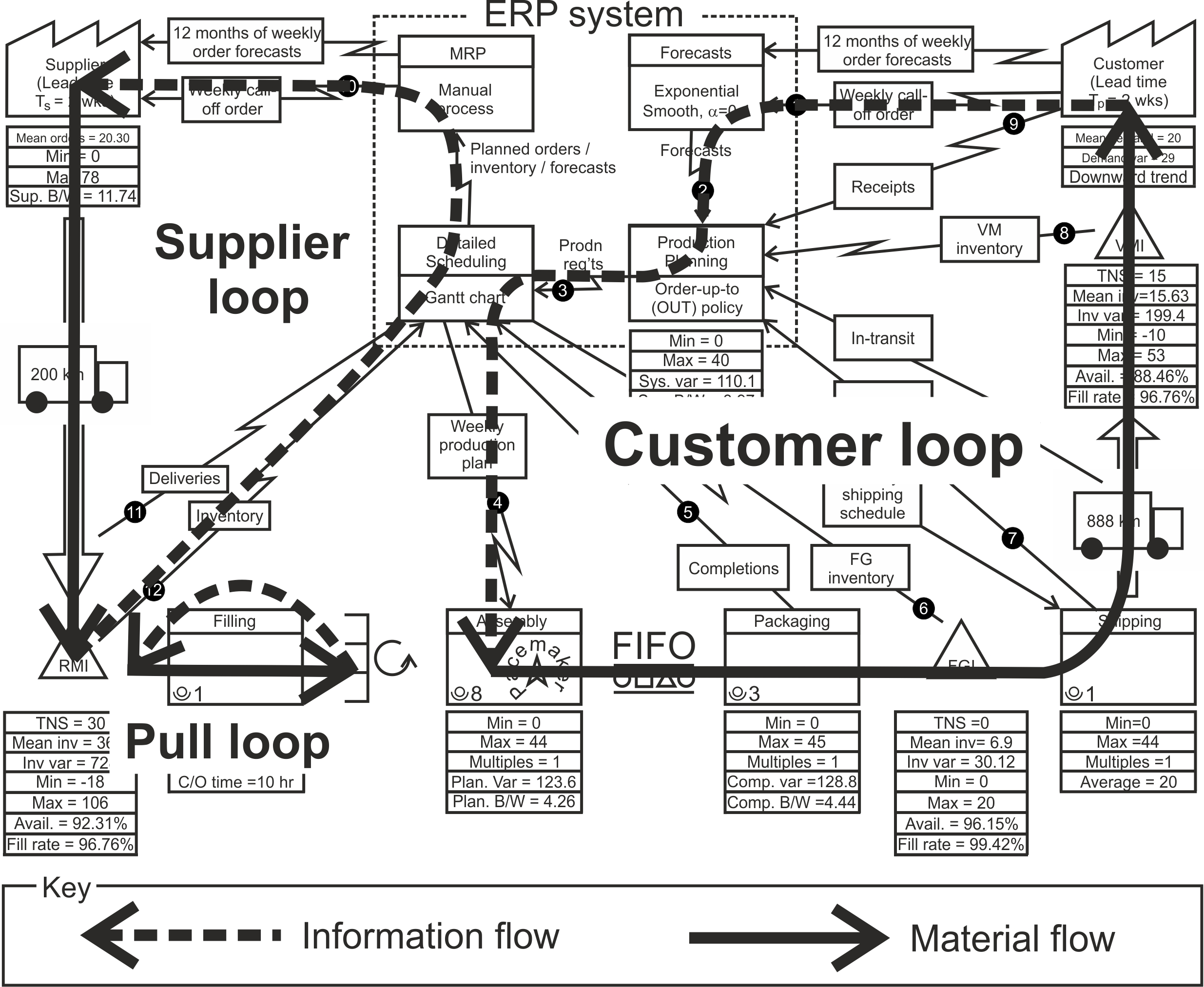
Figure 1.3: The two lead times in Acme`s value stream
Figure 1.3 also mentions a pull loop that receives its trigger from the pacemaker process, which takes inventory from the supermarket when needed. The supplying process reacts to the demand signal to fill the empty supermarket shelf; the pacemaker pulls inventory from the downstream processes. The supermarkets are sized to reflect the variability of the demand placed by the pacemaker, and the lead-time, batch size, and reliability, of the processes upstream from the pacemaker.
1.3 Measuring and understanding the dynamic performance of your value stream
Time series plots. The VSM also has a few black circles with a number in them, (i.e., \((8)\). These are reference points for the time series plots in Figure 1.2. These time series show the week-by-week (as this example value stream operates on a weekly cycle) inventory, production, and delivery quantities. Table 1.2 describes these time series.
| Index | Description | Notes |
|---|---|---|
| 1 | Customer call-off orders | The customer demand requested in the frequency of which the customer placed orders. |
| 2 | Forecasts | The forecast of the customer demands, in the frequency in which the customer orders. |
| 3 | System generated production requirements | The raw production plan created by your ERP system before any detailed scheduling or manual adjustments has taken place. |
| 4 | Confirmed production plan | The confirmed production plan, after detailed scheduling and any manual adjustments by the production team. |
| 5 | Completions | What was produced by the shop floor. |
| 6 | Finished Goods Inventory | A time series of the FGI awaiting dispatch to the customer. |
| 7 | Dispatches | What was dispatched to the customer in same frequency as the customer orders. |
| 8 | Vendor Managed Inventory | A time series of any VMI inventory held at the customer location. |
| 9 | Receipts | What was received by the customer. |
| 10 | Supplier call-off orders | What was ordered from your supplier. |
| 11 | Deliveries | A time series of what was actually received, in the frequency of which you order from suppliers. |
| 12 | Raw Material Inventory | A time series of raw materials, component or sub-assemblies from suppliers. |
| 13 | Customer Order Forecasts | Each week, a set of order forecasts are given to you from your customer which you use to plan future production and order raw material and components. |
| 14 | Supplier Order Forecasts | Each week, a set of order forecasts are given to the supplier to help them plan their future production and also order their raw material and components. |
Note: The inventory time series is often not readily available in practical settings; it can be inferred from the inventory balance equation, \(ns_t=ns_{t-1}+r_t-d_t\) (where \(ns_t\) is the inventory, \(r_t\) is what is received, and \(d_t\) is the demand at time \(t\)). This means that \((8)\) can be inferred from \((1)\) and \((9)\); \((6)\) can be inferred from \((5)\) and \((7)\); and \((12)\) can be inferred from \((4)\) and \((11)\). If available, the following data will also be useful but is generally of lesser importance than that detailed in Table 1.2.
- The order forecasts from the customers. This will be particularly useful for determining the level of uncertainty in the future guidance given by customers of their future orders.
- In-transit inventory on its way to customers.
- The weekly shipping schedule.
- Planned orders from which your supplier plans his production.
- The order forecasts generated by the MRP system or your commercial planning and forecasting team that is given to suppliers. This will be particularly useful for determining the level of uncertainty in the future guidance you give to your supplier about your future orders.
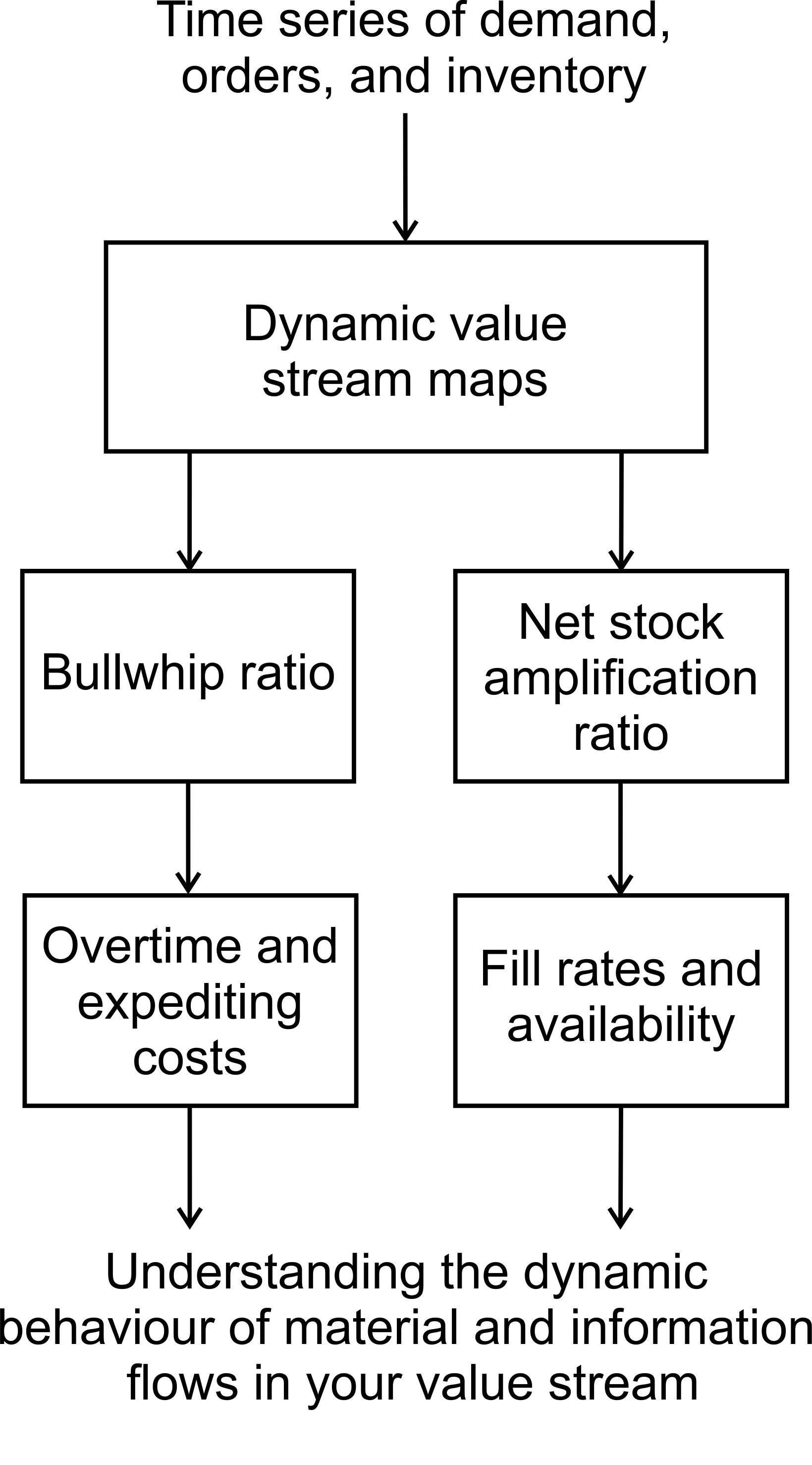
The dynamic value stream map (Figure 1.1) and the time series graphs (Figure 1.2) provide a useful way to eyeball the dynamic behavior of the supply chain. They also provide the base data for the key dynamic measures: NSAmp and Bullwhip.
What to look for in an eyeball analysis of your VSM
An eyeball analysis is a visual check of the time series. It is an important first step as it will guide some of your strategic decisions later in the process. A visual inspection can quickly identify the following factors.
- Demand volume. Is there a regular, repeating demand for the product (i.e. demand in every period)? Or is the demand intermittent?
- Trends. Are there significant trends up or down? Are they linear or exponential?
- Seasonality effects. Are there any significant seasonality effects? Daily, weekly, monthly, yearly?
- Bias. Are the average levels for demand, forecasts, production and shipments the same? Are there any significant and systematic deviations?
- Variance amplification. Where in the information and material flow is the variability of the system amplified?
- Batching. Do the production and distribution departments experience any significant batching effects? Is the batch size large compared to the average demand?
- Production reliability. Is a reliable production and distribution system present which consistently meets targets? If not, where is the variability in performance introduced?
- Hockey stick effects. Is there a monthly or quarterly dash to make the numbers?
The inventory variance measure: NSAmp. Companies often measure their supply chain inventory performance by the amount of stock that is present, often using Inventory Turns or Days of Sales. These are measures of inventory performance at a single point in time. A better measure of inventory performance is net stock variance amplification (NSAmp for short). NSAmp is a ratio of the variance of the inventory levels divided by the variance of the demand levels.
A measure of net stock amplification
Net stock amplification can be measured with: \[\begin{equation} \text{NSAmp}=\frac{\mathbb{V}[\text{Net Stock}]}{\mathbb{V}[\text{Demand}]}. \end{equation}\] The larger the NSAmp ratio, the more variability there is in the net stock levels. This measure is proportional to the safety stock requirements as the inventory service level achievements are linearly related to the standard deviation of the net stock levels.As it is based on variances, NSAmp measures inventory performance over an extended period, thus NSAmp is a more robust measure than just observing inventory held a single point in time for the following reasons:
- Inventory availability is experienced, and costs are incurred, at all points in time, not just at a single moment.
- Inappropriate institutional incentives easily contaminate instantaneous measures of inventory levels. For example, rewarding staff for low inventory, or stuffing channels with discounted product at the end of a financial reporting period, can easily create a hockey stick effect. The NSAmp measure is harder to manipulate as it measures performance over an extended period.
- NSAmp is a measure that is independent of service level targets and costs, and because it is normalized by dividing by the demand variance, it allows one to quickly compare inventory performance in different value streams.
- It is a measure of the process itself, not a measure of the output of the process.
- Average inventory levels are a function of the desired inventory service level. The variance measure is independent of service level targets and the average inventory.
The NSAmp measure can be applied to many different inventory locations in the value stream. If the measured inventory location is in the customer loop, then the inventory variance should be divided by the customer demand variance. However, if the inventory location is part of the supply loop (i.e., the raw material inventory), then the inventory variance should be divided by the variance of the completed production.
NSAmp is also a realistic inventory performance target within the natural constraints of your value stream (your lead-times and your customer demand). For example, it is known that the NSAmp ratio can never be lower than “one plus the lead-time” (i.e., \(NSAmp\geq 1+T_p\) or \(NSAmp\geq 1+T_s\)). However, if NSAmp is significantly greater than “one plus the lead-time” then either production smoothing is present (which we can check via the Bullwhip measure–see later), or there are problems with your forecasting or production/distribution/supplier reliability.
Measuring the variability of the load placed on production: The Bullwhip ratio. As well as measuring the variability of the inventory levels, we should also monitor the variability of the production/distribution orders divided by the variability of demand via the so-called Bullwhip ratio.
A measure of the Bullwhip effect
The Bullwhip effect is measured with: \[\begin{equation} \text{Bullwhip}=\frac{\mathbb{V}[\text{Orders}]}{\mathbb{V}[\text{Demand}]}. \end{equation}\] When the ratio is greater than one, then Bullwhip or order variance amplification exists. When the Bullwhip ratio is less than one, then we say that demand has been smoothed or that the demand variance has been dampened.The Bullwhip ratio is a measure of Mura, the Lean waste of the variable workload placed on production. While the variance of production orders would be a more direct measure of Mura, the ratio of the variance of the production orders divided by the variance of the demand is preferred as it normalizes the metric and allows one to compare performance between different value streams.
The link between Muda, Muri, Mura, and Bullwhip
Muda, Muri, and Mura are closely related to each other and the Bullwhip problem. The variable load placed on the production system is known as the waste of Mura. Mura causes the use of overtime and subcontracting to meet peak production and as well causing the idling that occurs when there is insufficient demand to fill the available capacity. The use of overtime and subcontracting is the waste of Muri. The idling from under-utilized capacity is a type of Muda waste. The variance of the production orders divided by the variance of the demand is known as the Bullwhip ratio. The Bullwhip ratio can be used to measure Mura and control Muda and Muri.Most value streams will naturally experience Bullwhip of between 2 to 5 unless they have taken special care to eliminate the waste of Mura. If Bullwhip = 1, then it is likely that a pull system exists (or a make-to-order supply chain exists) and this is often a significant reduction in Mura in many value streams. However, it is relatively easy to get the Bullwhip < 1 with the methodology in this workbook.
Experiencing the Bullwhip effect can be quite exasperating for companies: they invest in extra capacity, additional inventory, work overtime one week and stand idle the next, while at the retail store the shelves of hot products are empty and the shelves with products that are not selling are full. The Bullwhip effect also results in excessive use of expedited transportation, see Figure 1.4.
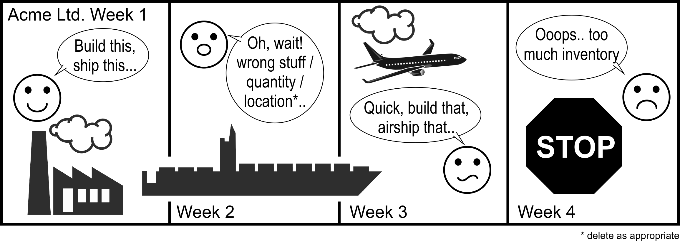
Figure 1.4: The Bullwhip effect playing out over time
There are at least four measures of Bullwhip in the value stream, and each one allows us to understand where variability is being generated in the value stream.
The four measures of the Bullwhip effect
- System recommended production requirements variance versus demand variance.
- Confirmed production variance versus demand variance.
- Completed production variance versus demand variance.
- The variance of the purchase order to suppliers versus production variance.
System bullwhip will usually be less than the confirmed bullwhip (the weekly planning meeting will likely add variability into the orders). The confirmed bullwhip is also likely to be less than the completed bullwhip measure (as the production system will either over- or under-produce to the required quantity). Note, the supplier’s bullwhip ratio is divided, not by the demand variance, but by the completed production variance, as the supplier’s orders are in the supply loop.
Finally, we note that inventory costs are incurred at an individual item level as customers want a particular item. However, Bullwhip costs are incurred at a group of items level as production capacity can often be used to make several different items. So when designing our value streams we may also want to consider, not only how the individual items behave, but also how they act as a group. To do this, we may want to select a particular production line and complete this analysis for all products that share the line.
Example: Calculating NSAmp and Bullwhip ratios from time series data. Table 1.3 provides time series data for demand, production orders and net stock levels for ten time periods. The variance of demand, \(d\), is calculated with the equation, \[\begin{align} \tag{1.7} \mathbb{V}[d]=\mathbb{E}[(d-\mathbb{E}[d])^2]. \end{align}\] Here \(\mathbb{E}[x]\) is the expectation operator. We can think of it as taking the average over all \(x\). Equation (1.7) shows that the variance of the demand is the expected value of the square of the deviations from the expected demand. Calculating the demand variance requires three steps 5.
Calculating the demand variance
Step 1. Calculate the expected demand by taking an average of the demand (sum all the demand and divide by the number of periods in the demand time series).
Step 2. For each period calculate the square of the current demand deviation from the expected (mean, average) net stock.
Step 3. Sum the squared deviations and divide by the number of demand points.To realize this for the demand series in Table 1.3 the average demand was first found to be 10, the squared deviations from the mean demand are in the fifth column, and the average squared deviation from the mean is calculated as 1.2. Therefore, the variance of the demand, \(\mathbb{V}[d] = 1.2\).
We can use the same procedure to calculate the variance of the net stock levels (10) and the variance of the orders (8.4) as shown in Table 1.3. Finally, we obtain the NSAmp and Bullwhip ratios as a ratio of the variance of net stock (orders) to the variance of demand: \[\begin{align} NSAmp=\frac{10}{1.2}=8.33 \end{align}\] and \[\begin{align} Bullwhip=\frac{8.4}{1.2}=7 \end{align}\]
| Time | Demand | Net stock | Orders | Squared demand deviation | Squared net stock deviation | Squared order deviation |
|---|---|---|---|---|---|---|
| \(1\) | \(10\) | \(2\) | \(10\) | \((10-10)^2=0\) | \((2-2)^2=0\) | \((10-10)^2=0\) |
| \(2\) | \(8\) | \(4\) | \(5\) | \((10-8)^2=4\) | \((2-4)^2=4\) | \((10-5)^2=25\) |
| \(3\) | \(9\) | \(5\) | \(9\) | \((10-9)^2=1\) | \((2-5)^2=9\) | \((10-9)^2=1\) |
| \(4\) | \(11\) | \(4\) | \(14\) | \((10-11)^2=1\) | \((2-4)^2=4\) | \((10-14)^2=16\) |
| \(5\) | \(10\) | \(-1\) | \(10\) | \((10-10)^2=0\) | \((2-(-1))^2=9\) | \((10-10)^2=0\) |
| \(6\) | \(12\) | \(-4\) | \(15\) | \((10-12)^2=4\) | \((2-(-4))^2=36\) | \((10-15)^2=25\) |
| \(7\) | \(11\) | \(-1\) | \(11\) | \((10-11)^2=1\) | \((2-(-1))^2=9\) | \((10-11)^2=1\) |
| \(8\) | \(9\) | \(0\) | \(6\) | \((10-9)^2=0\) | \((2-0)^2=4\) | \((10-15)^2=25\) |
| \(9\) | \(10\) | \(5\) | \(10\) | \((10-10)^2=0\) | \((2-5)^2=9\) | \((10-10)^2=0\) |
| \(10\) | \(10\) | \(6\) | \(10\) | \((10-10)^2=0\) | \((2-6)^2=16\) | \((10-10)^2=0\) |
| Average | \(10.00\) | \(2.00\) | \(10.00\) | \(1.20\) | \(10.00\) | \(8.40\) |
In the example, above we took the variances over 10 data points in the time series, mainly because that was the size of the table that fits nicely on the page. However, a natural question to ask is “over how many periods should I take the variance in my value stream?” The answer depends on the context. In some situations, you may only have a limited amount of data available, so you will have to go with the small number of data points that you have. In other situations, you might have many years of data available and, if this represents a stable part of the product’s life cycle, you can improve accuracy by taking a long history into account. However, in some situations, even when you have a large amount of data available, you may not want to use it all. For example, if a recently introduced product cannibalized the demand for the product under consideration, it makes sense to use only the most recent data in the variance calculations. Perhaps something happened in the supply chain (a new factory was brought online to co-produce this item, or there has been a rapid change in the demand volumes recently), that makes the older data irrelevant.
Your NSAmp and Bullwhip measures should be monitored on a rolling basis, each week providing a new measure of the dynamic performance of your supply chain. In this case, it makes sense not to make the time series history too long, as otherwise, the measure is slow to reflect recent changes. You may want to consider 52-week rolling horizons or even shorter. If you have quarterly (bi-annual) financial reporting seasons every 13 (26) weeks, it makes sense to use the last 13 (26) weeks of data in your variance ratios. Quarterly (bi-annual/annual) data will ensure that always there will be one, and only one, financial end-point in each measurement mitigating (or at least standardizing the treatment of) any artificial dash to make the numbers.
1.3.1 De-trending the time series
If there is a significant trend in a demand pattern, it may be beneficial to de-trend both the demand and the production order time series when you calculate the Bullwhip and NSAmp measures. This is due to the trend itself contributing to most of the variance calculations. De-trending the data first will allow much more sensitive and relevant measures to be obtained. Note, it is not necessary to de-trend the inventory time series if a constant safety stock target is present as the inventory levels will be automatically de-trended (but we must divide the inventory variance by the de-trended demand variance when calculating the NSAmp measure).
1.3.2 Measuring Bullwhip and NSAmp during holidays and shutdowns
Care must be taken when calculating Bullwhip and NSAmp during holiday periods as factory shutdowns (when nothing was produced) can create sudden, artificial changes in the Bullwhip and NSAmp measures. If not properly accounted for, these contaminated metrics are not representative of the progress made to reduce your Muri and Mura.
Consider the situation in Figure 1.5 of a two-week holiday shutdown occurring in weeks 11 and 12. There are four possible scenarios, depending on whether or not you and/or your customer are on vacation.
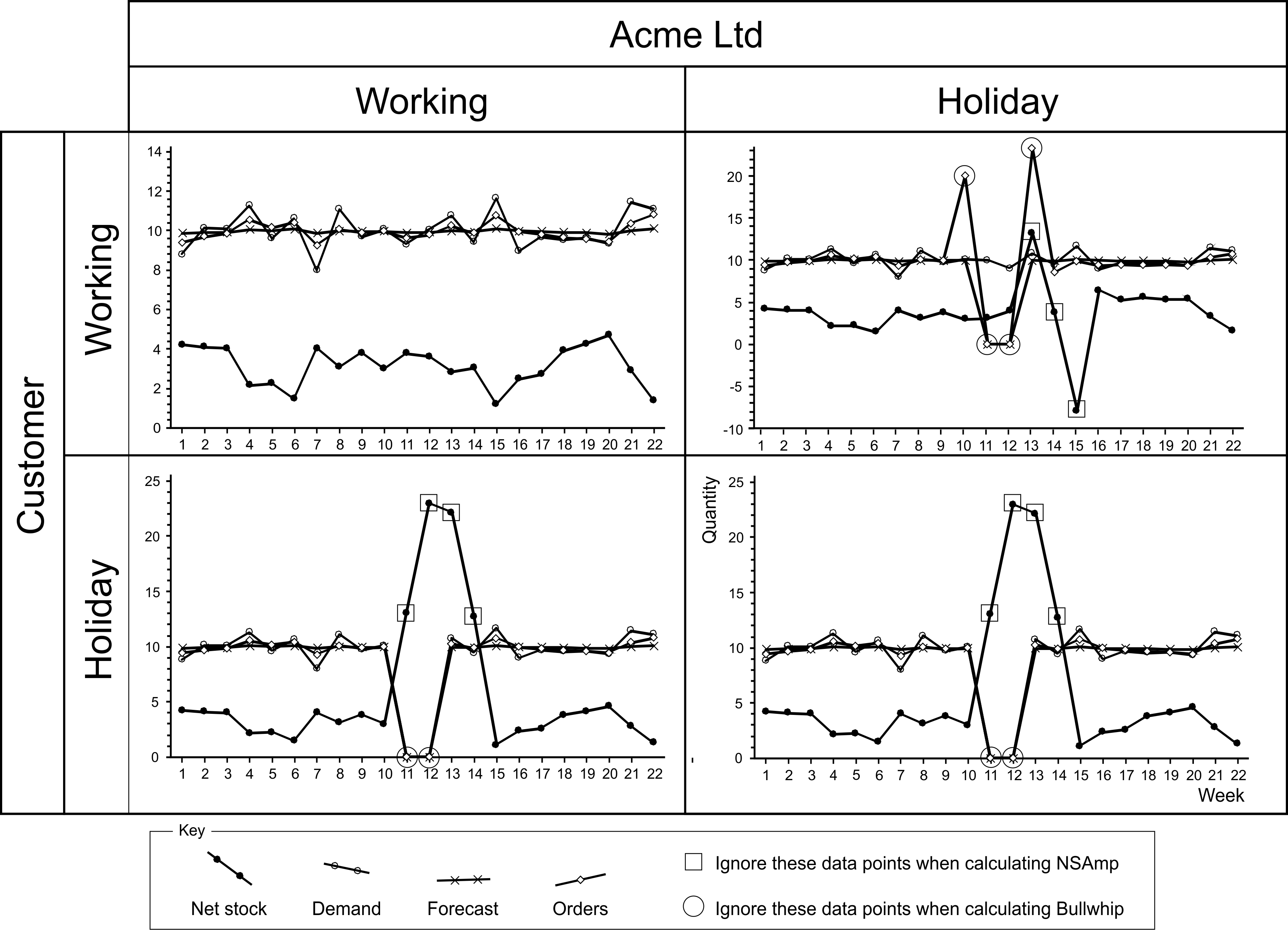
Figure 1.5: Data to ingore when calculating Bullwhip and NSAmp during holiday periods
If both you and your customer are working, then there is no issue to deal with, and you can carry on as normal. However, if either or both of you are on holiday, then you must take special care of your forecasts. Explicitly, you must manually set the forecasts to zero for the holiday period. For the week following the holiday, you will have to reinstate the predictions manually. Use the forecast for the week preceding the holiday as this new forecast (unless you have some inside knowledge as to why it should be something different).
If both you and your customer are on vacation, then the natural course of events is that demand, forecast, and orders will be zero during the holiday. There will be a build-up of inventory at the customer’s site as the shipments sent before the holiday arrive (assuming the transport company is still working over the holiday). Then after the lead-time, for the duration of the holiday, inventory will level off and start to be depleted. \(T_p+1\) periods after the end of the holiday, all would have returned to normal. However, for the two weeks holiday, you should ignore the order data when you are calculating the Bullwhip ratio. For the two weeks of the holiday and the following two weeks (because the lead-time \(T_p=2\)) you should ignore the inventory data when calculating the NSAmp ratio.
If you are working and your customer is on holiday, first set your forecasts to zero (which you reinstate when your customer returns). Then you should not produce anything until your customer returns to work. These actions will ensure that the dynamic consequences of this situation are the same as if you were both on holiday. In which case, you should follow the advice given in the preceding paragraph.
If your customer is working but you are going on holiday, you should set your forecasts to zero (this will have the effect of setting the production targets to zero during holiday periods). As you will need to supply the products that the customer will consume during the holiday, you will have to either pre-produce them before, or produce them in catch-up mode after the holiday, or a combination of both. In Figure 1.5, we pre-produced ten extra units in the week preceding the holiday and post-produced an additional ten units in the week after the holiday (to illustrate the different consequences–although you may want to pre- or post-produce items over a couple of multiple planning periods). The effect of the pre-production is to increase the inventory \(T_p+1\) periods after the start of the holiday; this excess inventory is depleted during your holiday. The effects of the post-production after the holiday can be observed in the inventory response until \(T_p+1\) periods after the holiday. When determining the Bullwhip ratio, you should ignore the periods when pre- or post-production is being built as well as the holiday period. When determining the NSAmp ratio you should ignore the \(T_p+1\) periods after the pre-production, the holiday and the post-production, see Figure 1.5.
Dealing with holidays and shutdowns
- Ignore the data points during periods of holidays and any pre- or post-builds when calculating Bullwhip ratios.
- During holidays and planned shutdowns, and for the lead-time after holidays or scheduled shutdowns and any pre- or post-builds, you should ignore the data when calculating NSAmp ratios.
- Only planned periods of downtime should be given this special treatment. Unplanned breakdowns/stoppages should be included in all Bullwhip and NSAmp calculations.
- Before shutdown periods, pre-build the high runners; there is no need to hold too much stock of the low runners.
1.4 Pop quiz. Understanding dynamic value stream maps
In the tutorial on Thursday (so don’t do it now), we will a go at answering the following questions in Table 1.4. You will need to refer to the material and information flow in Figure 1.1, to answer these questions.
| # | Question |
|---|---|
| Q1 | What is the pacemaker process? |
| Q2 | How long is the planning cycle? |
| Q3 | What level of availability is achieved by the vendor managed inventory? |
| Q4 | What is the variance of the demand process? |
| Q5 | How much raw material inventory do we hold on the average? |
| Q6 | What is the safety stock level at the raw material inventory location? |
| Q7 | What is the variance of the confirmed production plan? |
| Q8 | What is the variance of the vendor managed inventory? |
| Q9 | What is the supplier’s fill rate? |
| Q10 | What forecasting method is used in the ERP system? |
| Q11 | What is the customer’s lead time? |
| Q12 | How far away is the supplier? |
| Q13 | How much Bullwhip is generated by the planning system? |
| Q14 | What is the confirmed Bullwhip? |
| Q15 | What is the supplier’s Bullwhip? |
| Q16 | What is the supplier’s NSAmp? |
| Q17 | What is the maximum customer demand? |
| Q18 | What is the maximum quantity assembled? |
| Q19 | What replenishment strategy is used in the production planning system? |
| Q20 | Detailed scheduling is conducted with the aid of which planning tool? |
Sample answers will be given in Appendix C after the tutorial on Thursday.
1.5 Revisiting ACME’s value stream map
Returning to the issues at Acme Ltd that were highlighted in the process map. On the service level front, the FGI fill rate is 99.42%, relatively a good performance, but the fill rate at the VMI inventory was 96.76%, somewhat lower. The RMI fill rate was also rather poor at 96.46%. Availability, the proportion of period that ended with positive inventory was slightly lower (RMI availability was 92.31%, FGI availability was 96.15% and VMI availability was 88.46%). It is usual that availability is lower than the achieved fill rate.
The minimum and maximum net stock levels indicate the size of the backlogs (18 at the RMI, 0 and FGI, and 10 at the VMI) and the maximum inventory held (106 at the RMI, 20 at the FGI, and 53 at the VMI). The quantity of the product loaded onto the truck varied between 0-44.
We can see that the system production orders exhibit 3.97 times the variability of demand, the confirmed production is 4.26 times the variability of demand, the actual production variability had a multiple of 4.44. The replenishment order placed on to the supplier was 11.74 times more variable than the planned production (the supplier’s demand is the planned production). The average customer demand was 20, production varied between 0-44 each period (in the assembly and filling steps, and 0-45 in the packaging step). Supplier demand range from 0-78. These ranges would be expected for size of the Bullwhip ratios.
On the inventory variability front, the raw material variability was 728/123.6=5.88 times the variance of the confirmed production targets, the VMI at the customer site was 199.4/29=6.87 times more variable than the customers demand. This level of Bullwhip and NSAmp is quite common in supply chains who have not made a specific effort to remove the sources of mura and muri.
Finally, it is insightful to plot your Bullwhip and NSAmp performance on the efficient frontier graph in Figure 1.6. Here we place four points at the following (x,y) co-ordinates: (Planned production requirements Bullwhip, VMI NSAmp), (Confirmed production Bullwhip, VMI NSAmp), (Completions Bullwhip, VMI NSAmp), and (Supplier Bullwhip, RMI NSAmp). The distance of these points to curve in the graph, the efficient frontier give an indication of how large of a Bullwhip/NSAmp improvement opportunity is present in your value stream.
It is mathematically impossible to drive real dynamic performance below the curve (without using a make-to-order production strategy). The black dot on the curve represents the best possible location for minimizing NSAmp (and thus minimizing inventory variance and inventory holding and backlog costs). As Bullwhip approaches zero, the NSAmp increases. The best possible location for minimizing Bullwhip alone (and hence minimizing capacity related costs, minimizing mura, and muri) is in the top left hand corner of the graph. The thick black line on the curve is the efficient frontier where combinations of both Bullwhip and NSAmp costs are minimized, depending on their relative weighting. The thin line is an inefficient frontier as each point on the thin line can be mapped to a point on the thick line with the same NSAmp, but much less Bullwhip.
As all four of ACME’s data points are a long way to the efficient frontier, there is a plenty of dynamic performance gains left on the table. This work book will show you how to obtain them.
![The Bullwhip/NSAmp efficient frontier [^6]](Fig7.jpg)
Figure 1.6: The Bullwhip/NSAmp efficient frontier 6
At this point, we have documented our current supply chain structure and it’s dynamic performance. We have also had a glimpse of the dynamic performance gap in the efficient frontier graph. In many companies I have worked with, very few, if any, people will have an overview of the complete value stream. Insight into how the value stream behaves over time is usually limited. It will be eye-opening and cause many to ask “why does the system behave like that?” In the next chapter, we will think about what are the most important costs in your setting and consider a range of replenishment strategies and select the strategy that matches the needs and economics of our value stream.
References
This is a fictional example.↩︎
We can think of a supply chain as a river. Water flows down a river, material flows down a supply chain. Thus downstream means towards the customer, upstream means towards the raw material supplier in the supply chain.↩︎
Throughout this workbook we will assume a weekly planning cycle exists. If your value stream operates on a different cycle, replace every instance of week in this workbook with the length of your cycle.↩︎
All of the mathematical notation used in this workbook has been defined in Appendix B for easy reference. While I have tried to minimize the use of mathematics in this workbook, and there will not be any proofs, the use of some maths is necessary. We are after all dealing with the serious issue of production and inventory control!↩︎
Alternatively, if using a Microsoft Excel spreadsheet we could have used the “=VARP(range of cells to take the variance over)” command, but I wanted to first explain it independently of any software that we may use.↩︎
As NSAmp ratios have a mathematical form \(NSAmp=1+T_p+...\) (or \(NSAmp =1+T_s+...\)), then we plot \(NSAmp-T_p\) or \(NSAmp-T_s\) as the efficient frontier is independent of the lead time and we can use a standard graph. This also allows us to compare different products, or different value streams, or the same product after a lead time change, on the same basis.↩︎